The first Check-in App
for an Art Gallery in Caracas, Venezuela
‘Los Galpones’ is a self-funded Art Gallery in Caracas, Venezuela, that offers a place to relax and enjoy different activities, where all kind of artists can showcase their work. Their vision is to develop activities that enhance urban spaces through art shows, tours, concerts, and gastronomy while striving for a safe place for everyone.
Caracas, Venezuela
2005
Art gallery + E-commerce
I lead the user research and design implementation phases for this project.
Challenge
The challenge for 'Los Galpones' is to adapt to the market updates, position itself against the competition with a more attractive value proposition, and, improve the user experience. Starting with the first check-in app for tours in Venezuela where visitors can schedule their own tours or activities offered by the gallery.
Results
The designed app features a clean, clutter-free interface, making it easier for users to navigate and access essential features.
The improved onboarding process resulted in a 35% increase in new user adoption rates.
The addition of personalization and customization options enhanced user engagement, leading to a 25% increase in user retention rates.
35%
Improved onboarding process
25%
Increase in user retention
73%
Increase in time spent on the app
To achieve the best user experience, I've defined the scope of the project by breaking it down into these stages of development:
Insight:
People do not enjoy online tours as much as we thought.
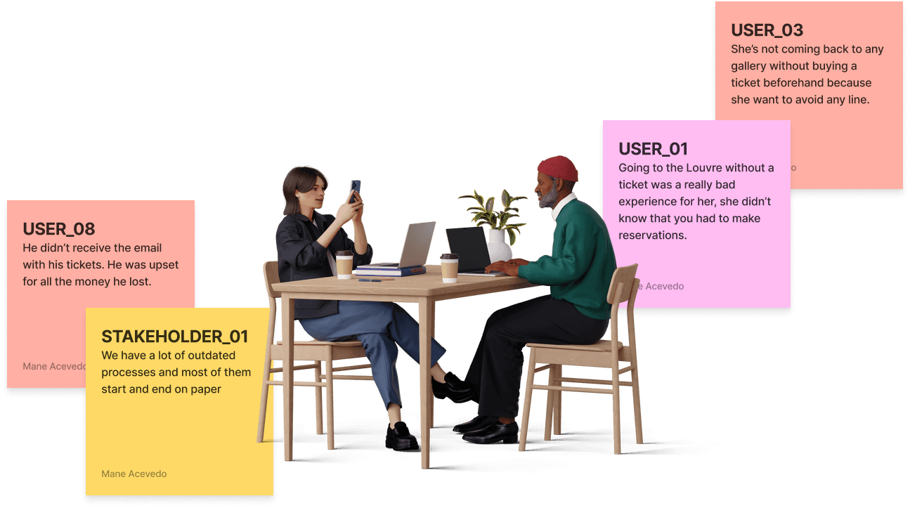
This project is for people who have an interest in the culture and heritage sector of their own city. I conducted interviews with a handful of people around the world who have attended different kinds of galleries and tours, their point of view was crucial for this study because it brought me a new perspective on the project I wasn't expecting: people do not enjoy online tours, they tend to go to art galleries, only for the experience those places can offer them.
With these interviews, I proceeded to create user personas to identify the different kinds of people who go to art galleries. One consistent kind of user I found was: people who had an interest in art and wanted to spend valuable time with their families.
Interviews
The first step to address this challenge was to understand the type of users I was working with, the city's environment, and how the gallery would offer various options for those in pursuit of enriching family encounters.
Step 1.
Interview with Stakeholders:
To understand the value proposition and the structure of its business, and be aligned with their concerns, expectations, needs, and vision of the product.
The interviews with the stakeholders gave me several important insights into the interest of the company in collaborating with more new talent, how to close the gap between the experience the artists can offer to users, and how to make a direct connection between the gallery and the job they want to showcase.
Step 2.
Interview with Users:
To understand their relationship with the gallery, services, pain points, and expectations.
Understanding your user is one of the most essential parts of UX design, *the use of Primary Research in this particular case was applied to avoid making assumptions about the user and their needs.
The interviews with the users gave me several important insights and improvements to consider, such as realizing how the use of mobile apps is increasing in the city and more people trust and rely on them.
Insight:
We’re not offering only tours.
After having a general view of how the gallery works, the services that offers, ideal clients, and agreements regarding the priorities, needs, and pains of the business, I had enough information to begin to outline the product.
For this, I did 3 main activities:
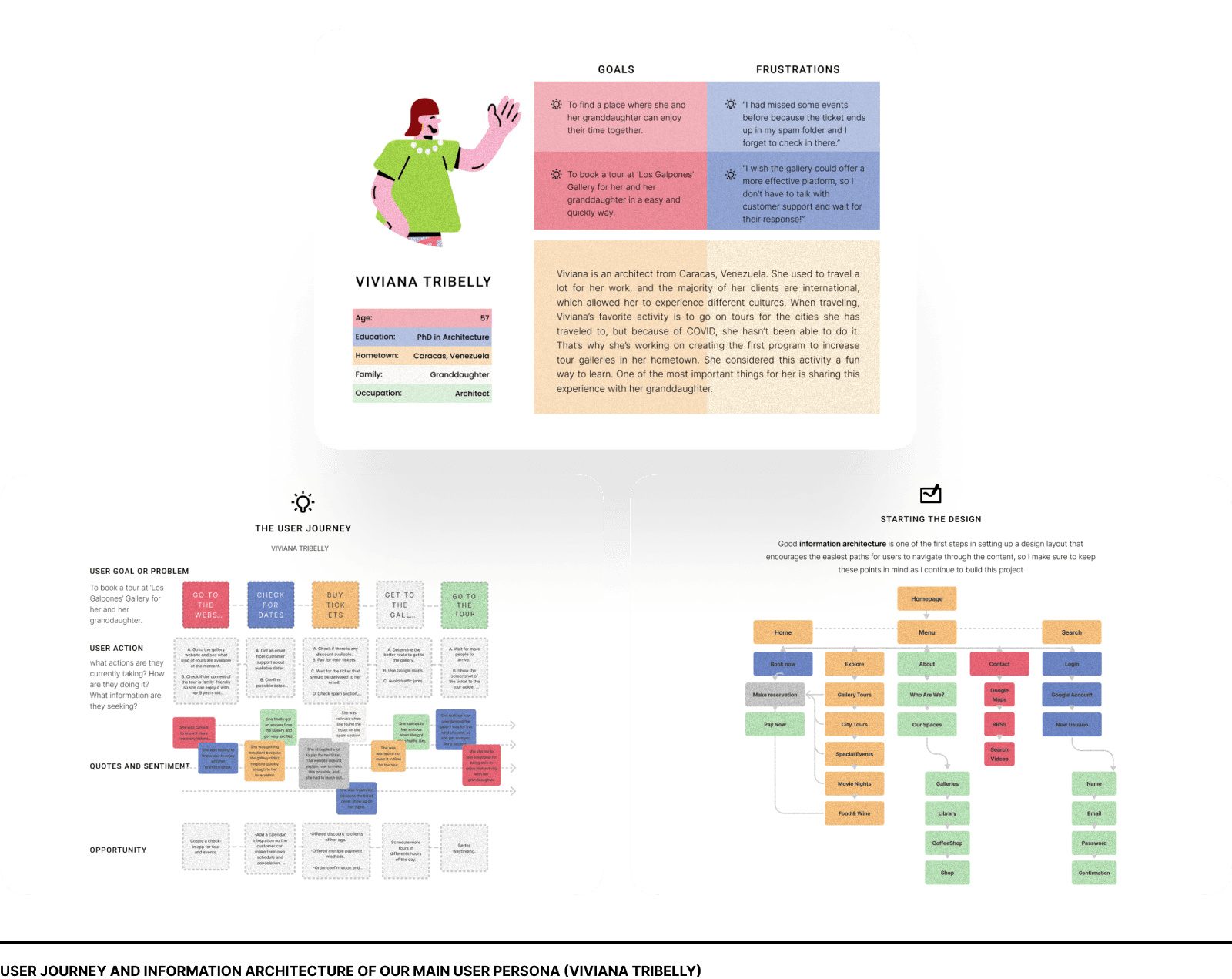
Creating a User Persona and a User Journey:
With all the information I collected from the interviews with users, I was able to define four types of users (Personas) and the user journeys for each service the gallery is offering. In this particular case study, I would be focusing the attention only on one type of Persona and one particular User Journey, that answers the following research questions:
This conceptual visualization of the users guided me in the creation of the product, also providing to the key stakeholders of the gallery, an updated vision of their clients and mapping the different moments and interactions with the gallery.
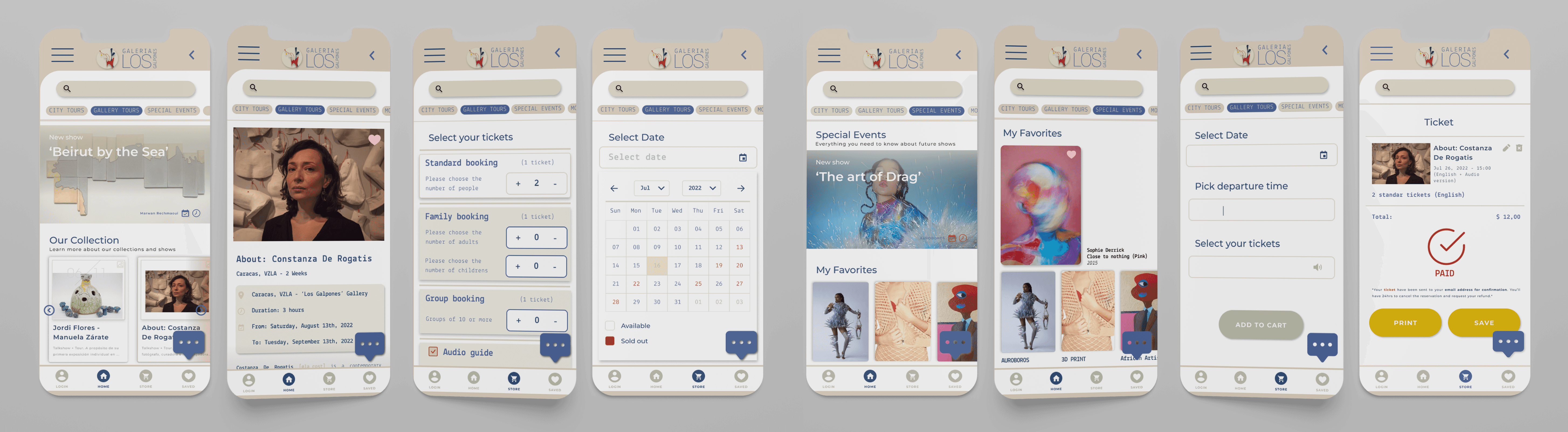
After that, I proceeded to make card sorting of the user journey, testing this activity with the users of the app. This helped me to reorganize all the content and create a site map with a goal: to help users navigate through the app and book a tour of the gallery.
With this new structure, I ensure fast access to sections identified as a priority (giving a solution to the most significant pain points) Sections like ‘gallery tours’ and ‘store’ need to be always at hand and just a few clicks away.
Insight:
Iteration is the keyword.
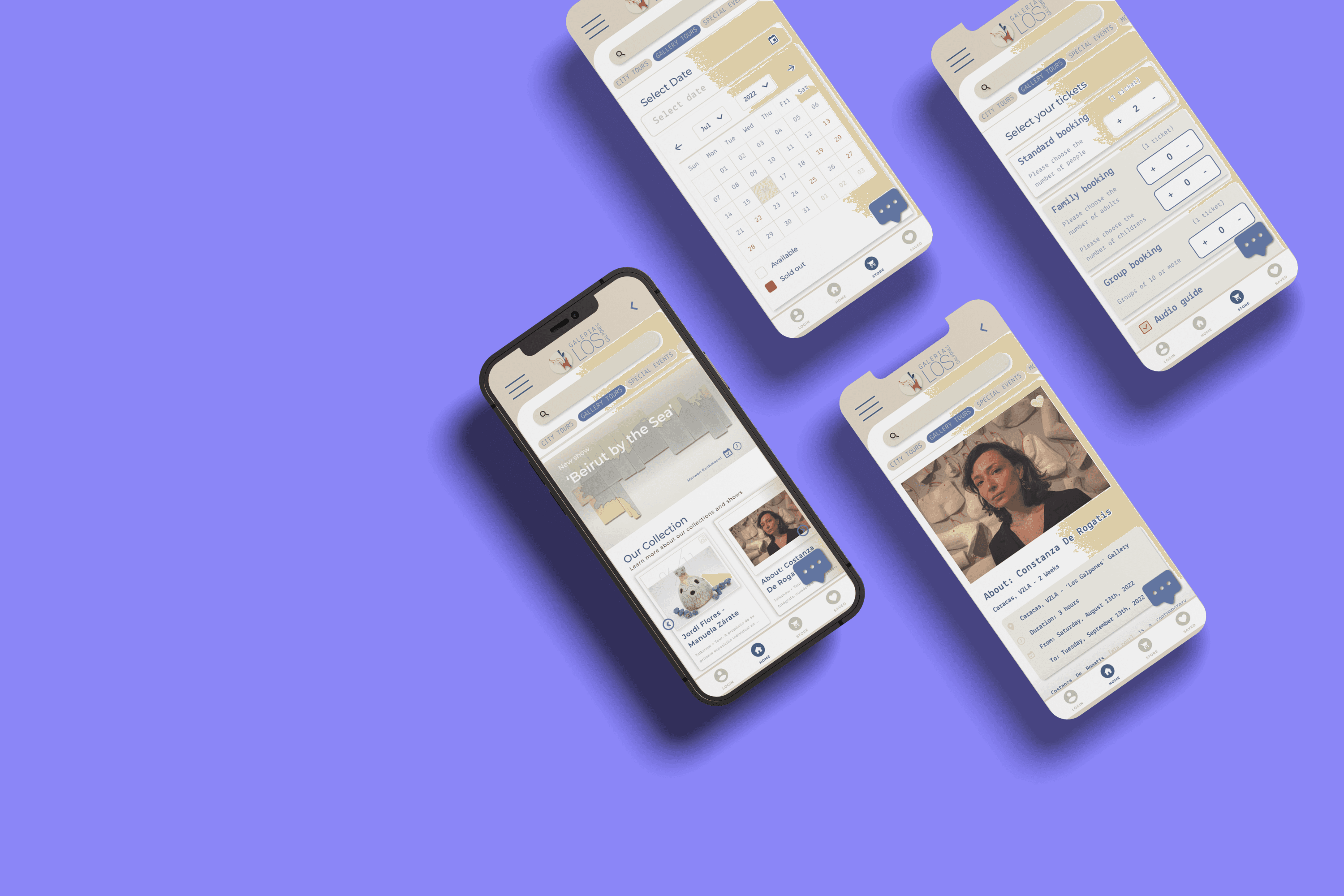
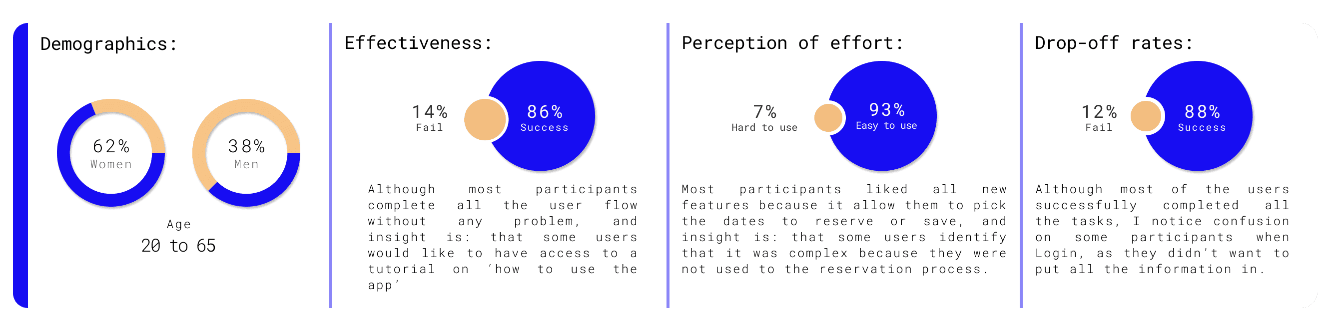
This phase was key for the making of the app, providing tangible results for the gallery. Since its relationship with technology was not very fluid, the prototype was helpful in transmitting the new experience.
In this particular case study, I’m showcasing some essential parts of the final prototype, but still unifying all the flows, so the users could navigate more easily. This made the iteration process and design more precise and clear.
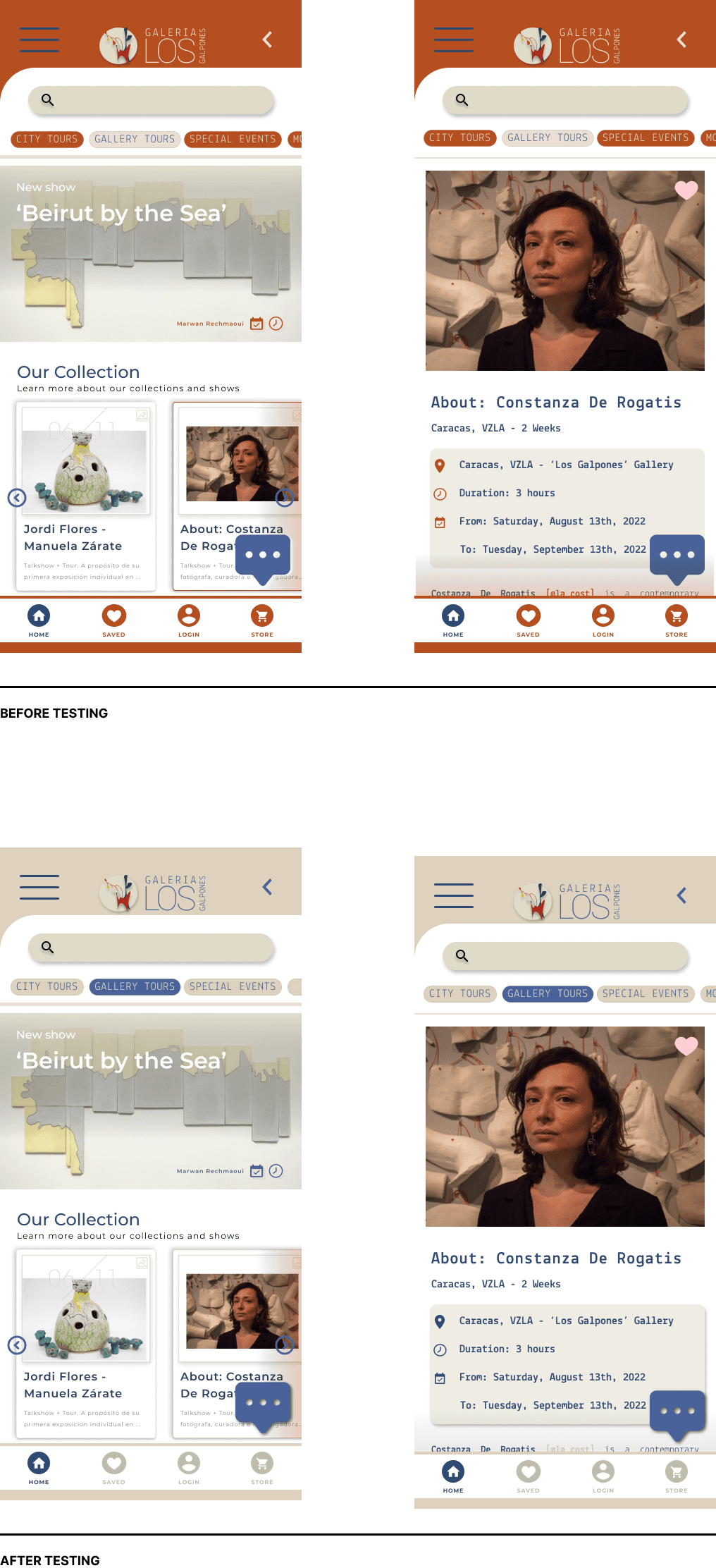
In general, I had a very positive experience and reception of the prototype. Compared with the system they were used to for making reservations (WhatsApp messages and emails that were direct to the users’ spam folders) the users perceived significant improvements, both in the design aspect and, in the navigation. However, the usability tests showed me some areas for improvement:
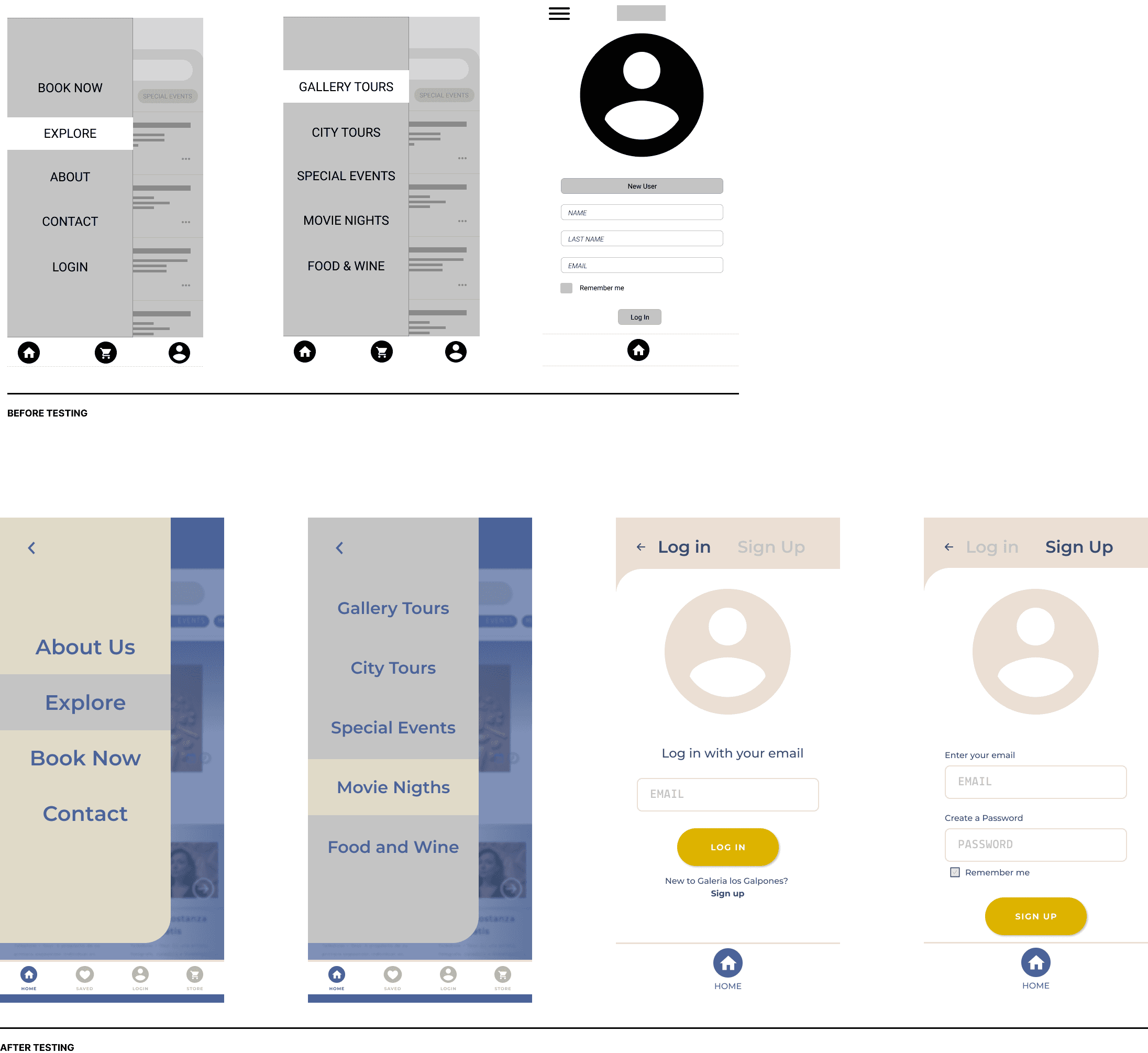
What I needed to improve after testing:
Affordance on Login:
The login was critical because most users were confused with the two options (on the dropdown menu and the taskbar) After the test, I iterated the access and deleted the option of the dropdown menu.
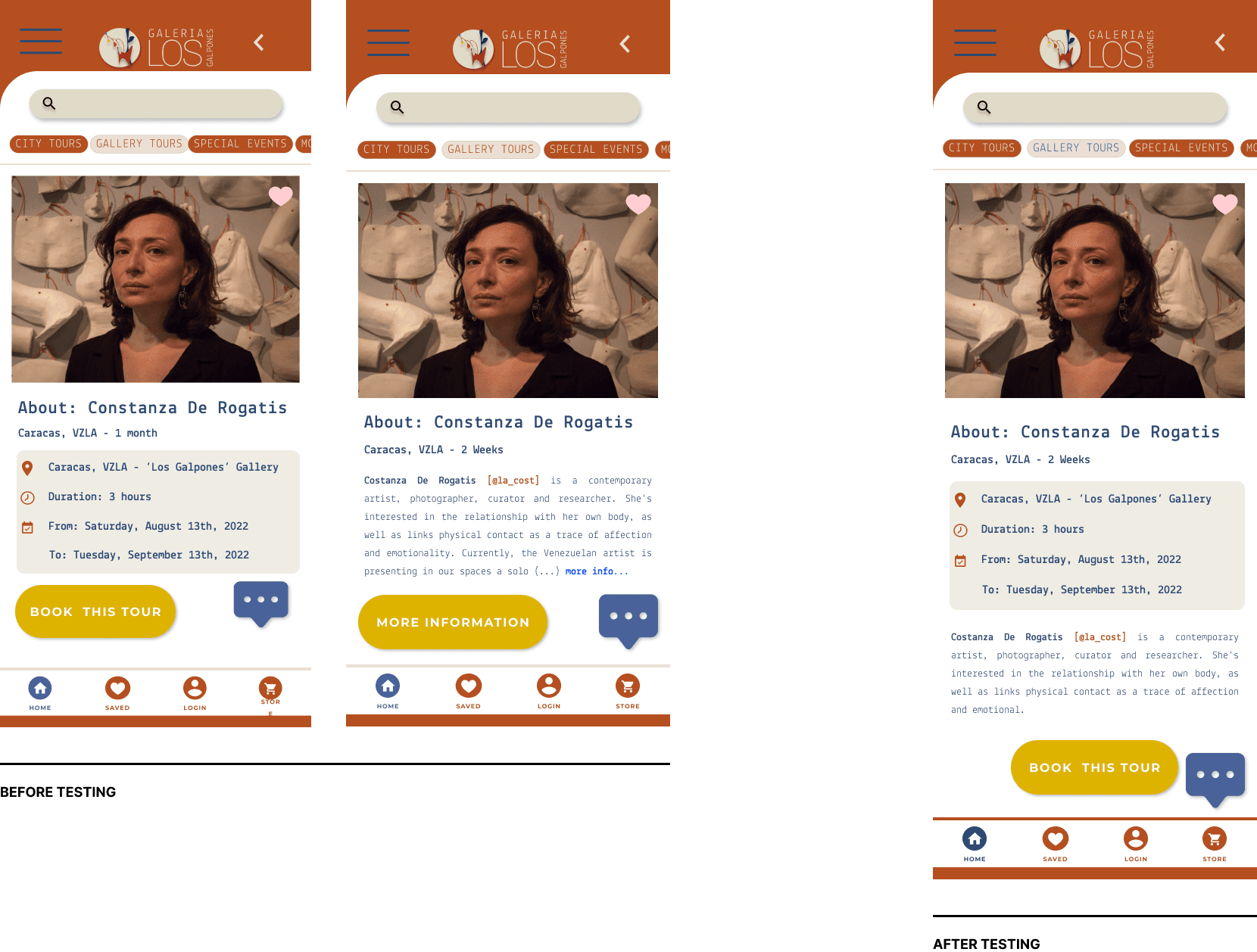
Reorganize the layout of information
When the user used to click on an option, they would click on the link of “more information” to learn more about the Tour that they were selecting. With the new layout, the information is found on just one screen and they only need to scroll down.
Look and Feel
After a few iterations and conversations with the stakeholders, we agreed to have a cleaner look and feel for the app, with the condition that this would be treated in the future with more users so we can make it more accessible
This project will be in development at the beginning of the summer. After that, it'll be launched, and I'll do usability tests to see where we can iterate again to fix any problem we encounter along the way.